Color Theory
Juried by Kaegan Sparks
Curatorial Statement
“Every act of seeing leads to consideration, consideration to reflection, reflection to combination, and thus it may be said that in every attentive look on nature we already theorise.” –Johann Wolfgang von Goethe, Theory of Colours (1810)
“A dread of, nay, a decided aversion for all theoretical views respecting colour…has been hitherto found to exist among painters,” wrote Johann Wolfgang von Goethe near the end of his 1810 treatise Theory of Colours. However, he conceded, this was “a prejudice for which, after all, they were not to be blamed.” Goethe’s study of color issued from a personal crusade to “liberate the phenomena once and for all from the gloom of the empirico-mechanico-dogmatic torture chamber”—that is, the prevailing notion in his age (and ours) that color is an aspect of light which can be rationally explained by the laws of physics. A century earlier, Isaac Newton’s optical experiments with prisms had yielded the ROYGBIV spectrum, a rubric with which he assigned each visible shade to a measurable wavelength of light. In “razing this Bastille”—Goethe’s dramatic metaphor for his attempt to dismantle the Newtonian paradigm—the German Romantic attempted to substitute Enlightenment science with a more subjective phenomenology. Maintaining that the human mind and spirit correspond intrinsically with the natural world, Goethe argued that knowledge of color could not be severed from our experience of it, including both sensory perception and emotional effect. Goethe’s color theory, which he hoped would be applied by practitioners from chemists to dyers to artists, inflected subsequent nineteenth- and early-twentieth-century art ranging from J.M.W. Turner’s diaphanous seascapes to Hilma af Klimt’s mystical altarpieces. – Kaegan Sparks
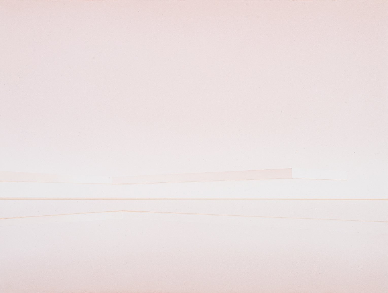
I:Krys Flood- Aquilin|William Pagano|Kirsten Simonsen
This exhibition begins by invoking Goethe’s conviction—which harks back to Aristotle—that color derives from transitions between light and darkness. The details of Krys Flood-Aquilino’s crepuscular scene are almost totally subsumed by shadow. By contrast, subtle chromatic deviations from pure white in William Pagano’s paintings are only perceptible when viewed together. Soupy gradations are annotated with casual self-reflections in Kirsten Simonsen’s watercolor, revealing coincident fluctuations in color and affect.
Brian Reeves
Look At You (as if installed)
Digital drawing, programmed with Processing
19" x 6"
$0.00
Christine Barney
Northern Lights
Glass
20" x 12" x 10.5"
$14,500.00
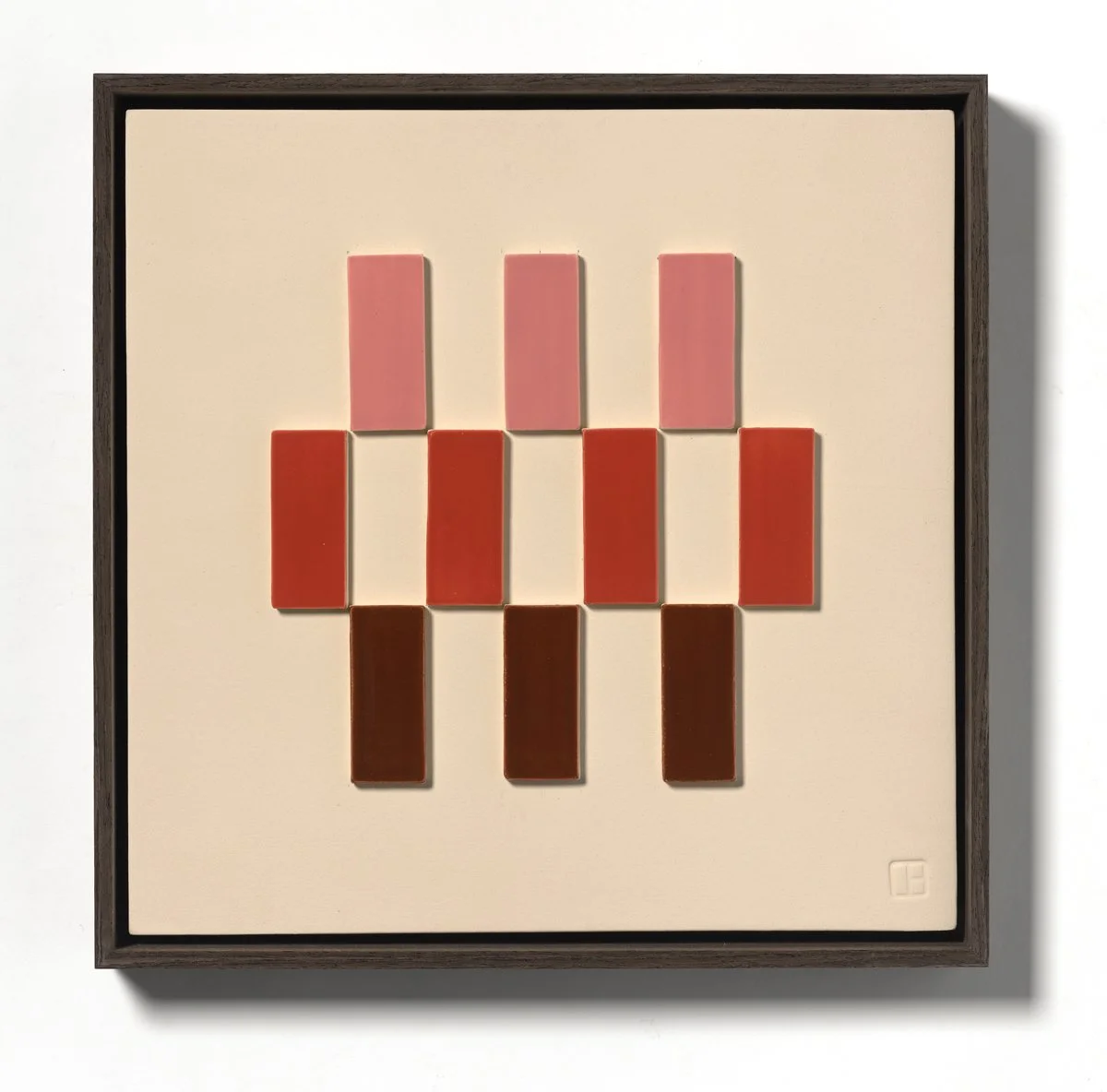
Danielle Bewer
Stacked Grid - Pink/Red
Ceramic - Wood frame
15" x 15" x 2"
$2,250.00
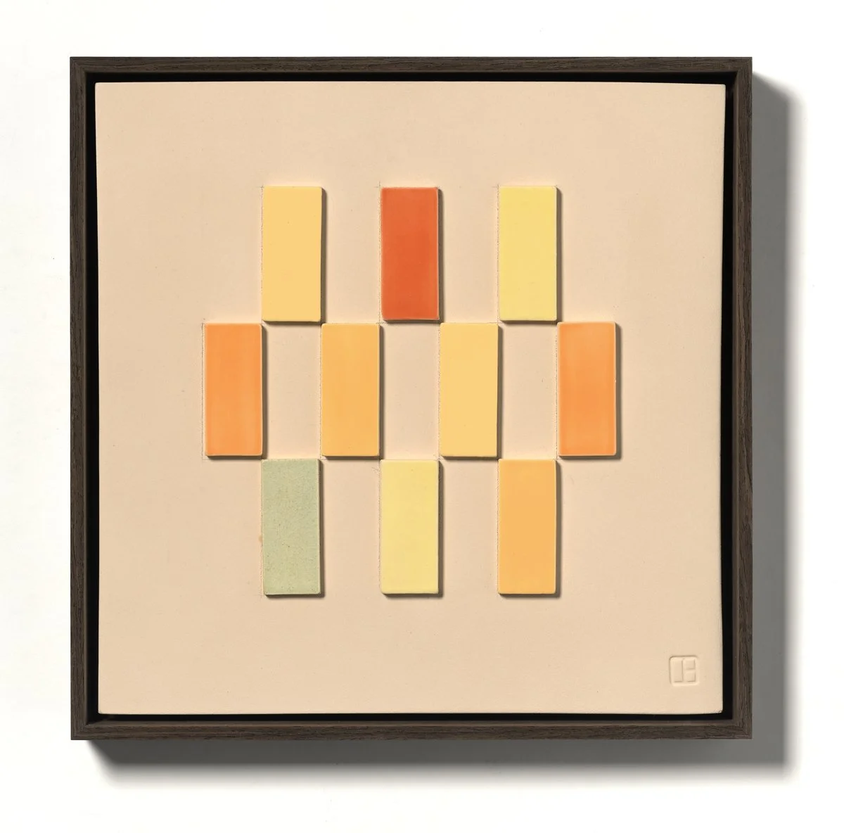
Danielle Bewer
Stacked Grid - Peachy
Ceramic - Wood frame
15" x 15" x 2"
$2,250.00
Marilyn Stubblebine
Vision
Acrylic on board
24" x 30" x 1"
$1,400.00
II:Brian Reeves|Christine Barney|Danielle Bewer|Marilyn Stubblebine
These works comprise systematic investigations into color’s relational attributes and tricks that they play on the eye through translucency, overlay, and simultaneous contrast. Brian Reeves’s billboard graphic suggests an update to The Great Gatsby’s advertisement for Doctor T.J. Eckleburg, whose yard-high, disembodied retinas surveil an industrial valley of ashes.
III:Robin Adsit|Morgan Suter|Jacob Cullers
Robin Adsit’s Reduced Visibility, alongside her other paintings eclipsing and layering fragments of the human figure, summons the effects of skin tone and secondary sex characteristics on social recognition. Flesh mediates figure and ground in works by Morgan Suter and Jacob Cullers. Red Mountains 2, a tribute to Cullers’s brother who was killed while deployed in Afghanistan, proposes a discomfiting visual analogy between ruddy flesh and jagged terrain.
IV: Maggy Aston|Emily Denton|Michelle Ranee Johnson |R.A. McBride |Tommy Goguely
Painted and panoramic horizons offer color case studies in works by Maggy Aston, Emily Denton, and Michelle Ranee Johnson. R.A. McBride’s accidental “celluloid landscapes” emerge from the leaders of analogue film strips, and Tommy Goguely’s long exposures produce various abstractions from the same seascape by rotating a camera along the skyline at different dates and times.
Mark Niskanen & Jani-Matti Salo
Uncanny Sky I-III
Video, 4K, MOV
Dimensions: Variable
Duration: 01:15, loop
$2,000.00
V: Mark Niskanen & Jani-Matti Salo|Virginia Primozic|Chung-Fan Chang|Elyse Elguezabal
In these works land, sky, and sea, are vehicles for abstraction. Through selective cropping, Virginia Primozic makes patterns from the Rio Grande Gorge and Mark Niskanen & Jani-Matti Salo summons color fields out of hazy skies, following Impressionists of the nineteenth century in attending to the aesthetics of air pollution.
VI: Galya Rosenfeld|Capitana F|Gerald Hushlak|Michael Jacobs
Galya Rosenfeld’s Fabricated Landscapes translate photographs to modular textiles composed without thread or glue. Color is likewise evinced through textural variation in neighboring works that also manipulate and layer digital source material. Capitana F’s dot-matrix silkscreen starts with a screenshot detail of a 1620 painting by the Baroque woman artist Artemisia Gentileschi, a reference shared by Joan Ryan’s figurative oil Susanna Revisited in the final section.
VII: Rebecca Kautz|Angie Zielinski|Rebecca Buchanan
Three pairs of paintings by Rebecca Kautz, Angie Zielinksi, and rebecca buchanan, apply sophisticated palettes to domestic interiors, formal effusions, and urban facades.
VIII: Sandra Frankel|Flora Wilds|Jena Ataras|Joan Ryans
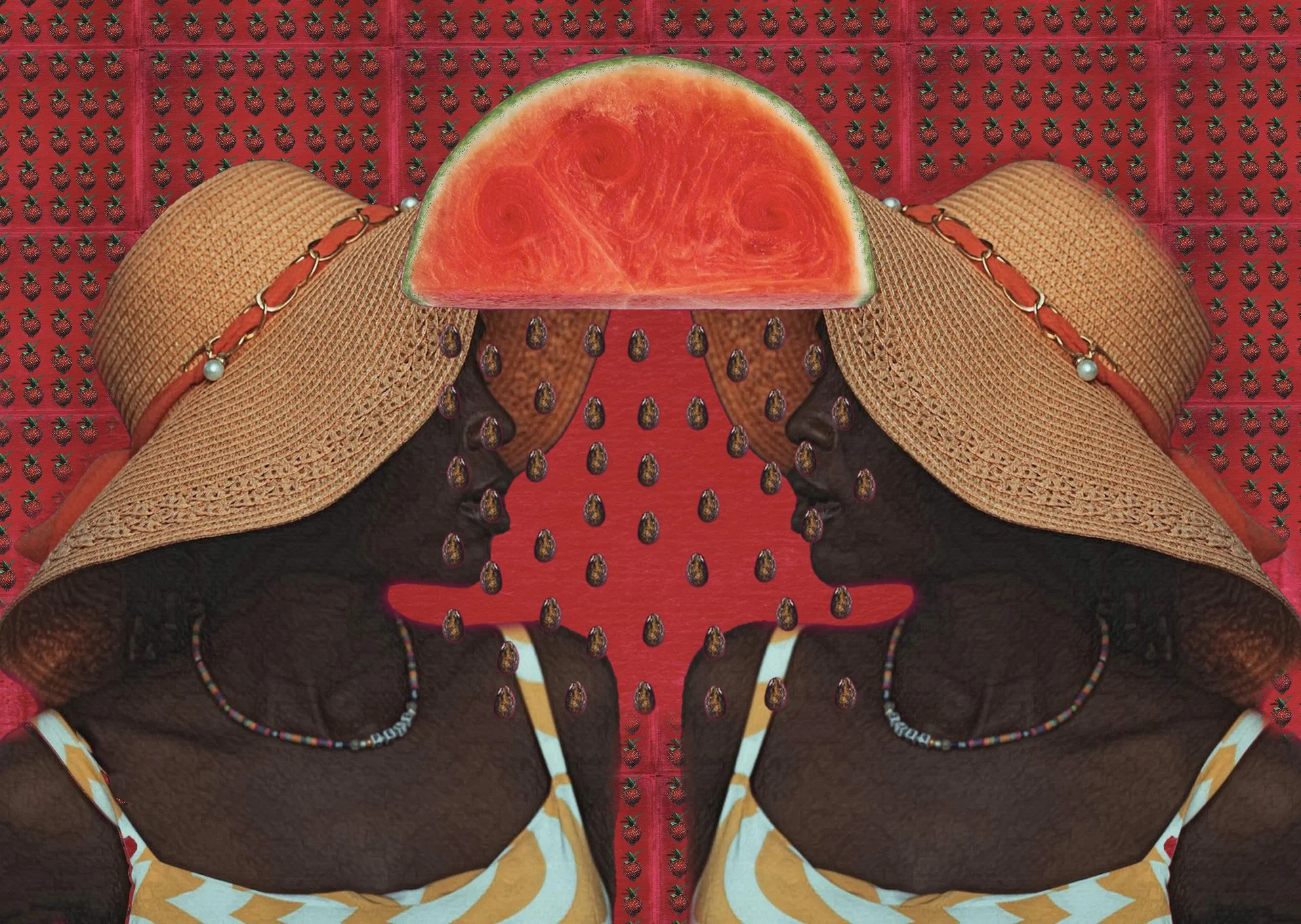
This final grouping foregrounds color’s impact on social relations. In Sandra Frankel’s photograph taken at the Bedouin Market in Be'er-Sheva, a vendor’s black veil sharply contrasts with the vibrant pile of jackets for sale. Flora Wilds’s hay bale of button-down shirts alludes to the purported neutrality of white masculinity, while Jena Ataras’s poppy compositions follow Black artists like Cheryl Dunye and Charles Ethan Porter in recouping the watermelon from a history of racist stereotypes. Skin color is phantasmal in Joan Ryans’ figural conglomerations, in which silhouettes in dusky purple or chartreuse look away, at screens, or off canvas as the world burns.


